Every business needs multiple hooks to bring in customers. The first hook is, of course, a product or service that consumers want. The second is a catchy name and slogan. The final hook every business needs is iconic branding. No hook is more important than another, but iconography and branding are often overlooked by startups. We’re here to tell you that’s a mistake.
Visuals can hook consumers and turn them into customers. Moreover, they can define your company. Put simply, imagery should reflect your brand and the message you want to convey to the world. That’s why a credible design agency will ask you to define your brand identity before its designers draft any logos or visuals.
The right visuals do more than present your brand identity to the world. Catchy iconography can increase sales. According to a consumer survey by Demand Gen Report, 91% of buyers prefer visuals over other forms of marketing content, including written content. Additionally, as reported by Hyperise, personalised imagery decreases “cart abandonment rates” by 17% and increases “conversion rates by 200%”.
Honouring the Past but Looking Towards the Future
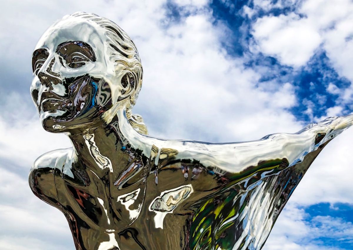
The point here is that iconography and visual branding matter. That’s why successful companies are constantly monitoring the impact of their visuals and, if necessary, updating them. Rolls-Royce did just that in 2020. The longstanding British car band updated its iconography to reflect a new “edgier” image brought about by an increase in female Rolls-Royce drivers and a drop in its target market’s average age (down to 43 years old).
The revamp saw illustrator Chris Mitchell refine the iconic Rolls-Royce statuette. As well as simplifying the statuette, Mitchell switched the way it’s facing from left to right. The idea behind the switch is that icons facing right are looking towards the future. This links to the idea that Rolls-Royce is evolving in line with modern trends while still maintaining its original branding.

Combining Old Ideas With New Ones
Another example of iconography capturing the spirit of evolution while keeping one foot in tradition is an online game called Slingo. Essentially a mash-up of bingo and slot gaming, Slingo has an iconic logo that’s been successfully used across the online gambling industry. The logo is pitched at an angle that makes it look as though letters are emerging from the background and moving into the foreground.
The stylised logo is similar to the Rolls-Royce statuette in the sense it’s moving from the past into the future. This captures the spirit of Slingo because, as we’ve said, it takes two classic games (bingo and slots) and turns them into something new and fresh. What’s particularly impressive about Slingo symbols is that they’ve been adapted to match the themes of popular slots. Again, this plays on the idea of something old but new.
For example, Sweet Bonanza is a popular online slot that’s famous for its multi-coloured sweet symbols. The Slingo version of this game takes inspiration from this by making each letter of the logo a different colour. The same goes for Slingo Starburst, which plays on the space vibe by making it look as though the logo is a shooting star. Adapting the logo to match a game it’s taken inspiration from creates a sense of familiarity while simultaneously offering a new experience.
Impactful Iconography is Poignant and Malleable
Another British brand that Australian startups can learn from when it comes to iconography and branding is Lyle’s Golden Syrup. Lyle’s logo remained untouched for 140 years. However, in an attempt to reflect modern tastes, it was updated in 2024. The old image of the lion with bees circling it was an allusion to the Biblical story of Samson.
Lyle’s current brand director, James Whiteley, didn’t want to lose this. However, he also told the BBC that the new logo needed to appeal to “the everyday British household while still feeling nostalgic”. The result was an artist’s impression of a lion’s head (see Instagram post above). A single bee remains in the image, but it’s blended into the lion’s mane, giving it a fresh feel without losing touch with the past.
These examples show the power of branding and how iconography needs to be fluid. It needs to reflect your company’s core values but move with the times. Evolving in line with modern trends gives visuals more impact and, in turn, makes it possible to transpose them into different settings. So, if you’re a startup, make sure visuals are sharp enough to hook consumers now and in the future.


 Explore top-rated compensation lawyers in Brisbane! Offering expert legal help for your claim. Your victory is our priority!

 "
"


